QNB Factoring Web Site x Frank
Creating a Faster Corporate Experience: The New QNB Faktoring Website
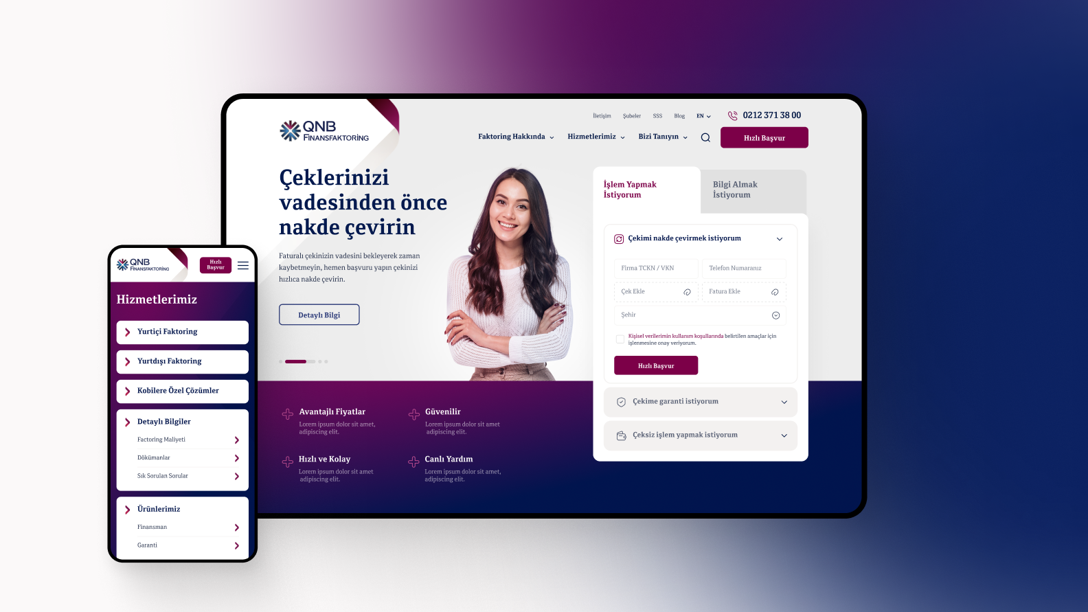
We design digital experiences that remove friction from everyday tasks. For QNB Faktoring, our focus was to build a simple, fast and user-friendly corporate website that allows visitors to take action immediately. The result is a clean and accessible digital experience centered around quick processes and clear information.
Project Overview
What Is the Project?
QNB Faktoring offers financial services that help businesses manage their cash flow and receivables. The website plays an important role in explaining these services and giving users a fast way to request information or start an application.
Our task was to redesign the website with a focus on clarity and speed.
Goals
From Traditional Corporate Layouts to a Fast and Action-Oriented Experience
Most visitors come to the website with a clear purpose. They want to apply quickly, request information or learn what factoring is. The previous structure required more steps than necessary.
We aimed to design an experience that:
- makes quick actions instantly visible on the homepage
- gives users a simple and guided way to request information or submit an application
- explains factoring services in a clear and accessible format
- improves readability and navigation across all devices
- strengthens trust through a modern and consistent visual identity
Our focus was to make the website feel fast, helpful and easy to understand.
Our Role
Designing a Homepage Built for Quick Actions
Frank redesigned the website with one goal in mind: help users reach what they need as quickly as possible.
Action-Focused Homepage
We brought key actions to the front. Users can now:
- apply online
- request a quote
- ask for information
- explore factoring services
Information Architecture
All service content and corporate sections were reorganized to reduce cognitive load and make navigation more intuitive.
UX Design
User journeys were simplified so that common tasks require fewer steps. Buttons, forms and service descriptions follow a logical and clear structure.
UI Design
The updated visual system uses clean typography, spacious layouts and a consistent color palette that reflects QNB Faktoring's brand and communicates reliability.
Responsive Interface
The entire experience was optimized for mobile users who often need to access quick actions on the go.
Why It Matters
For financial services, a fast and understandable website builds trust.
Users should not struggle to find simple information or complete a basic application.
The new QNB Faktoring website:
- makes quick actions easier to access
- simplifies processes for new and existing customers
- improves clarity across services and corporate content
- strengthens the perception of reliability and professionalism
- delivers a seamless experience on mobile and desktop
The result is a modern corporate website that supports users in the moments that matter.
Want to Learn More?
Frank creates digital experiences that make complex services feel simple.
If you want to build a faster, clearer or more intuitive corporate website, we are here to collaborate.
More Projects
Explore more work we have crafted for leading brands.
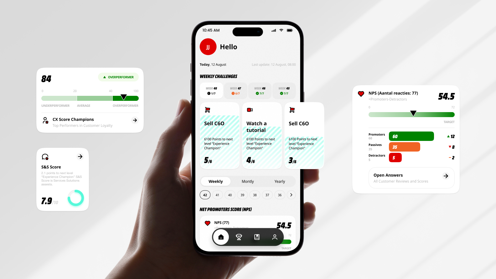
MediaMarkt Champions Digital Experience
The platform is designed to motivate, engage, and support employees in delivering exceptional customer experiences.
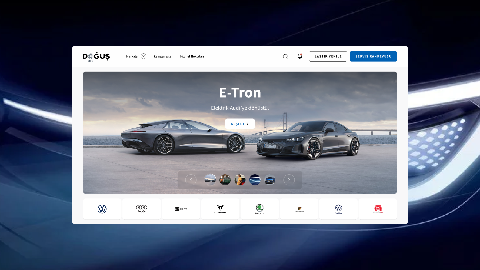
Dogus Oto Corporate Web Site
Frank redesigned Doğuş Oto's corporate website to simplify the customer journey and strengthen the brand's digital experience.
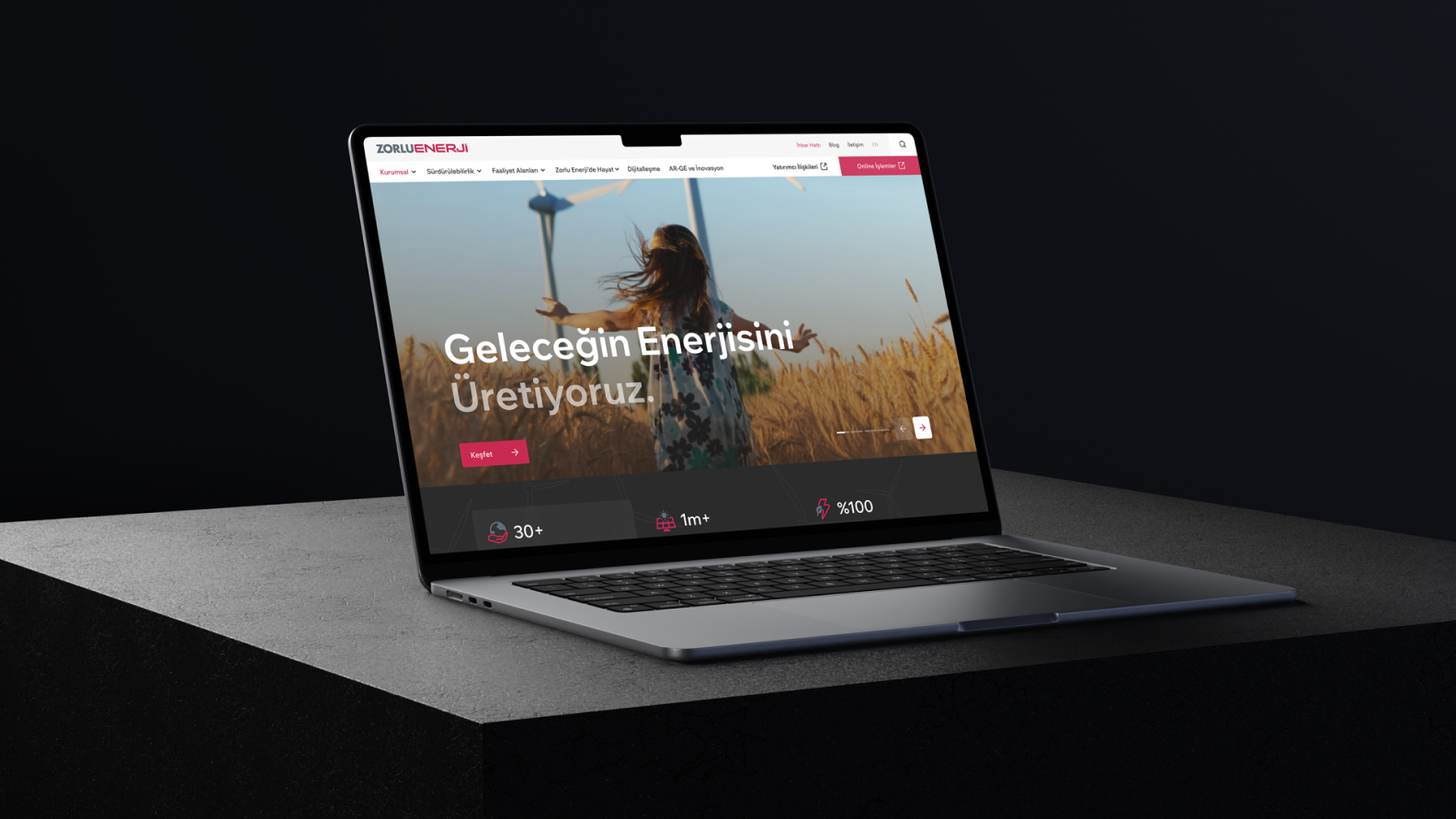
Zorlu Energy Corporate Web Site
Frank redesigned Zorlu Energy's corporate website to simplify access to services and strengthen the brand's digital presence.
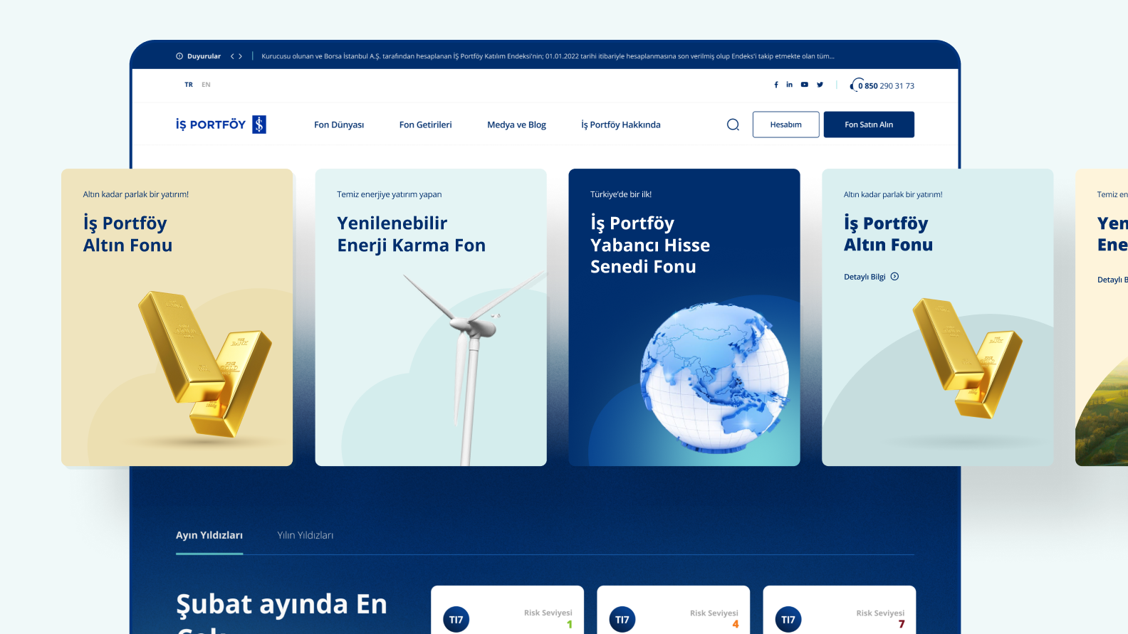
Is Asset Management Digital Platform
We built a data-driven asset management platform—combining UX design, CMS, and custom data integrations for real-time fund tracking.
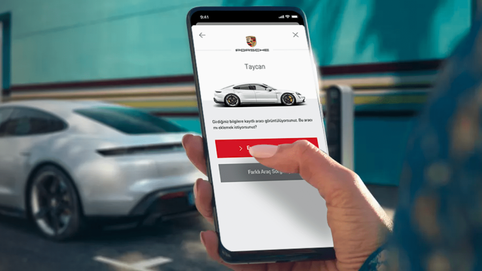
Porsche Mobile Application Digital Experience
Frank redesigned the Porsche Turkiye mobile app with a refined interface for brand enthusiasts, making privileges and EV charging more accessible.
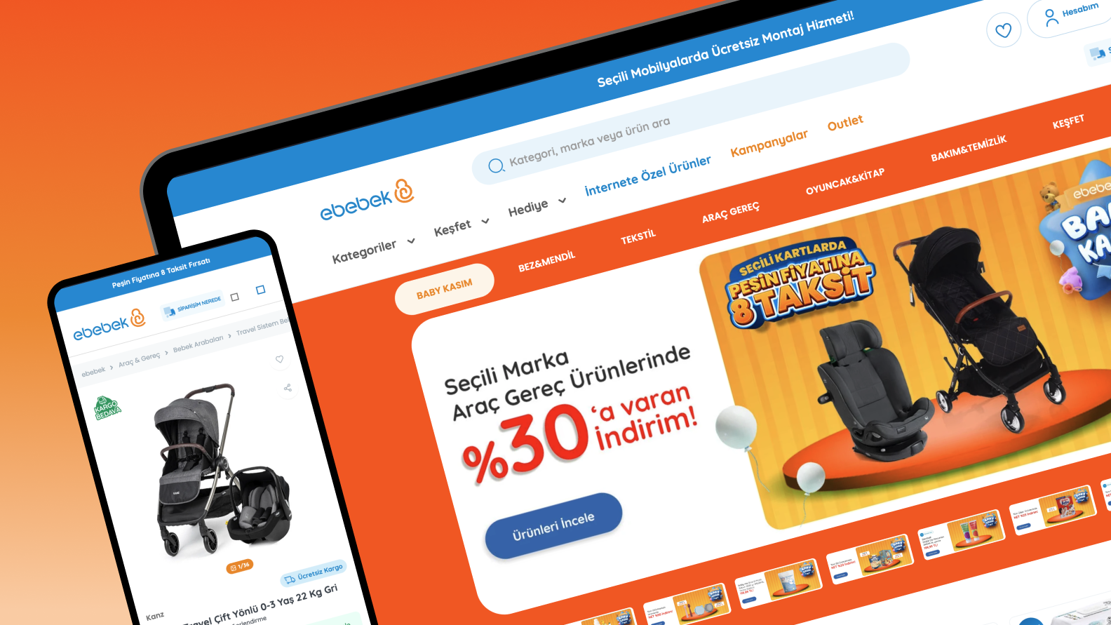
Ebebek Digital Experience
We redesigned and developed responsive e-commerce interfaces, delivering a smooth shopping experience optimized for parents.
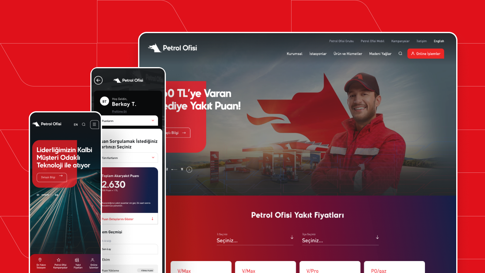
Petrol Ofisi Corporate Website
Frank redefined Petrol Ofisi's digital presence with a robust, user-centered website built for performance and growth.
Volkswagen Turkey Corporate Website
Frank designed the Volkswagen Passenger Cars website for Turkiye, a clear and user-focused platform for exploring models and brand services.